SEA s.r.l.
SEA s.r.l.
SEA s.r.l.
SEA s.r.l. | brand identity
Client: SEA s.r.l.
Industry: metalworking
Year:2024
SEA s.r.l. is a company specializing in piping and metal carpentry, primarily serving the naval sector but also operating in other industrial fields. During a period of growth and renewal, the company’s leadership identified the need to establish a strong and recognizable visual identity — one that could represent the business consistently and professionally.
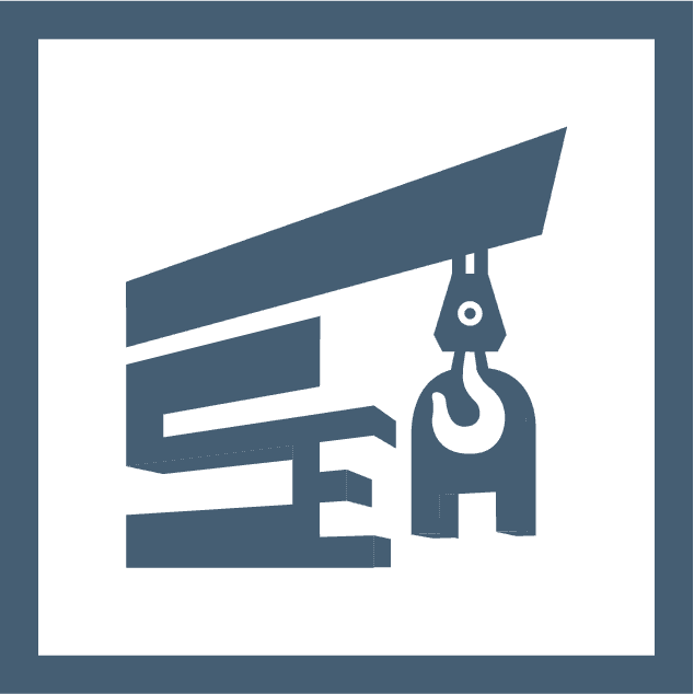
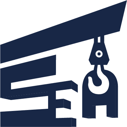
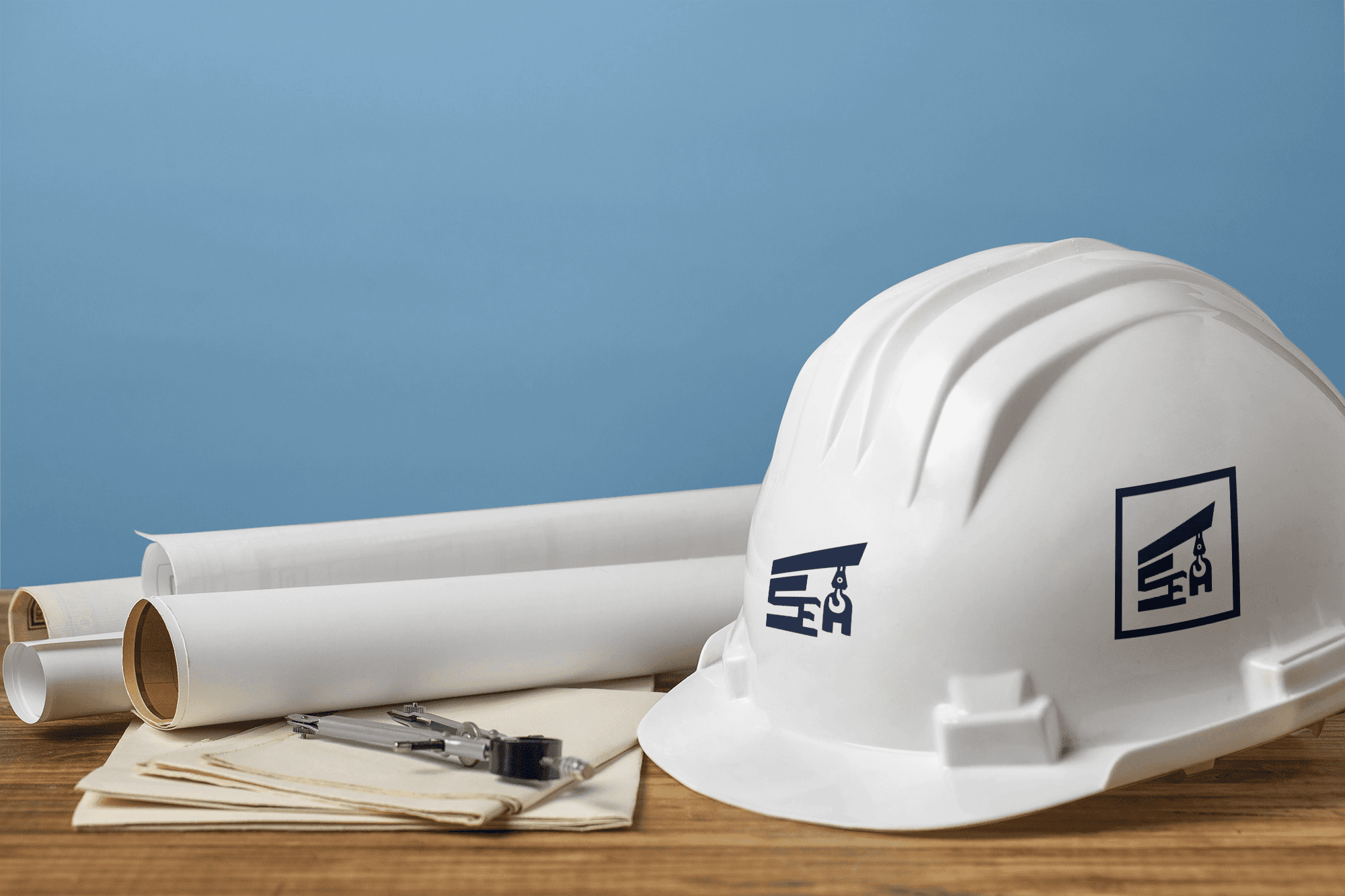
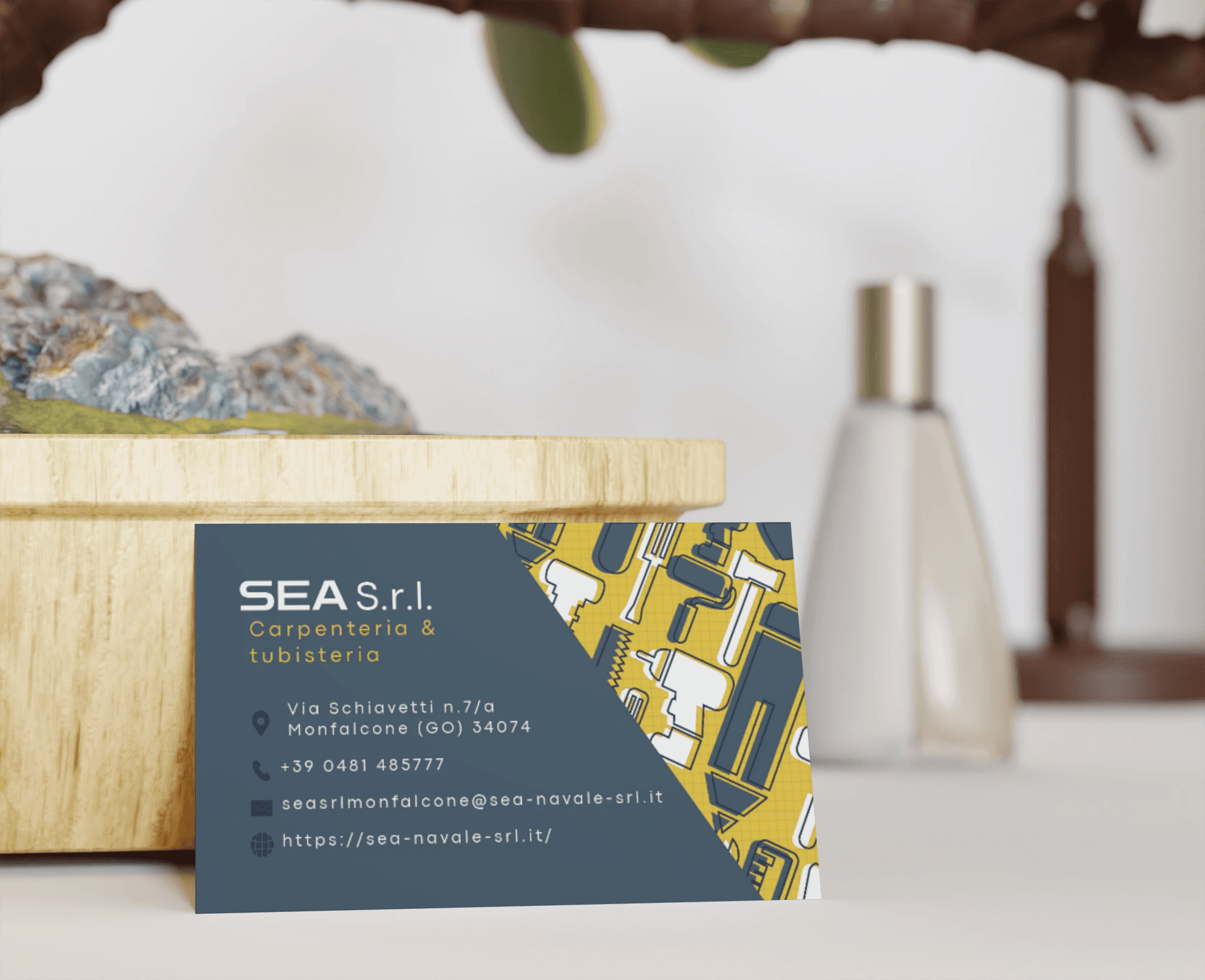
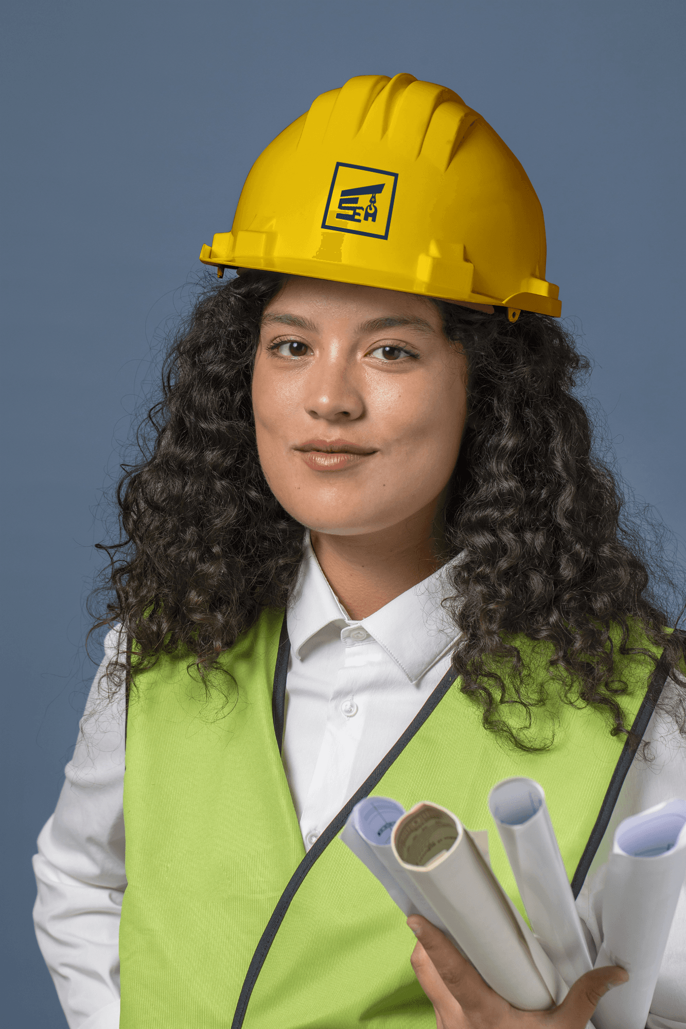
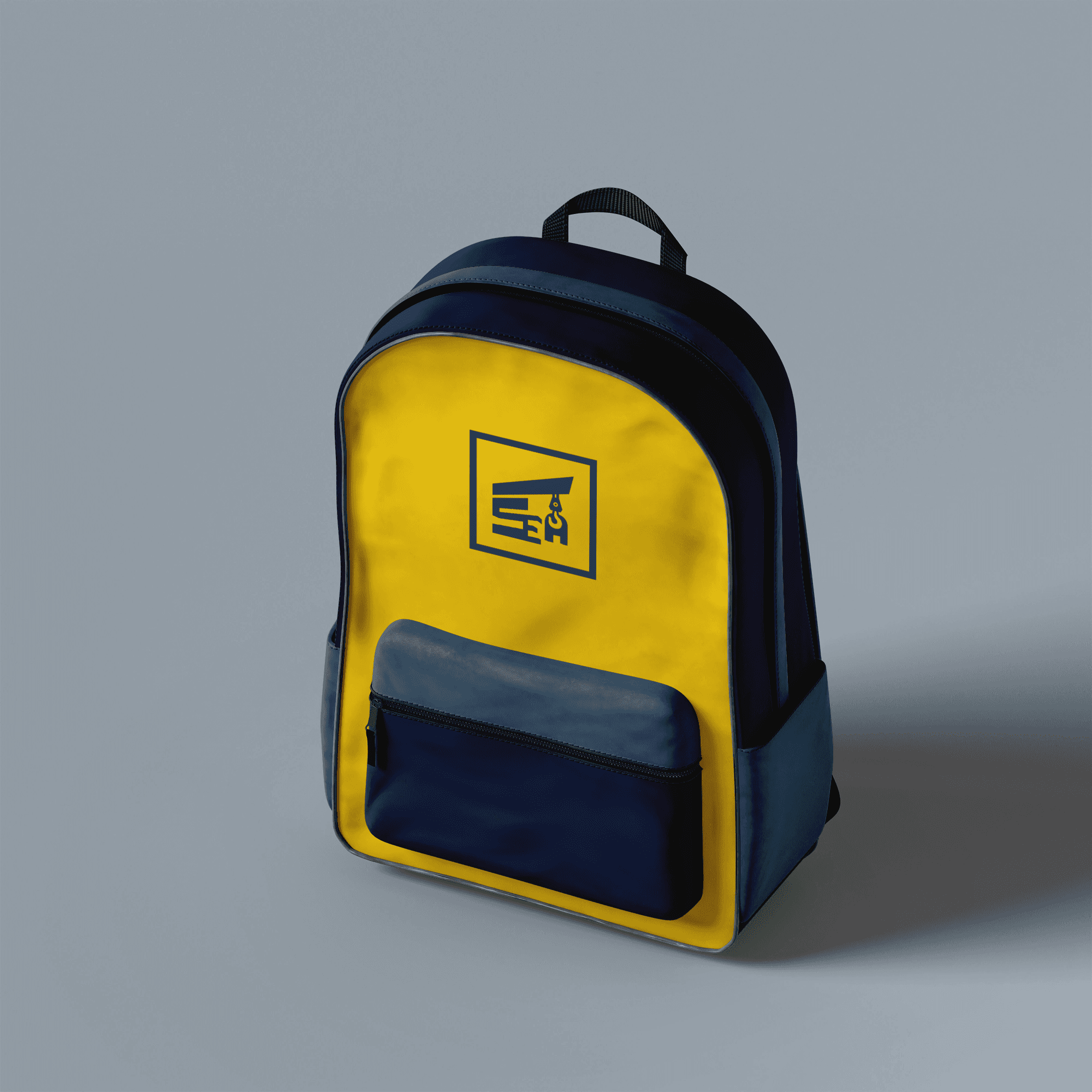
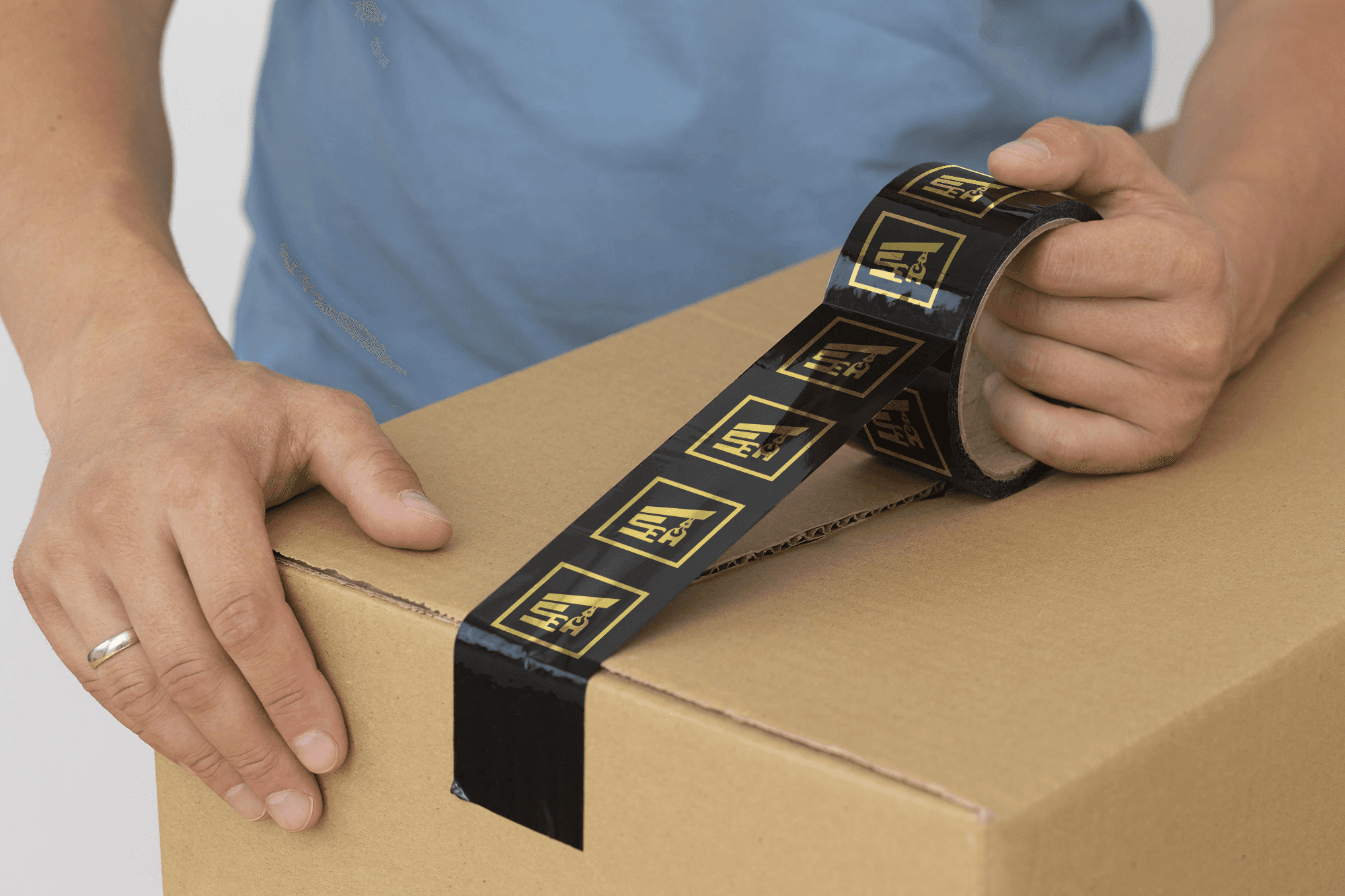
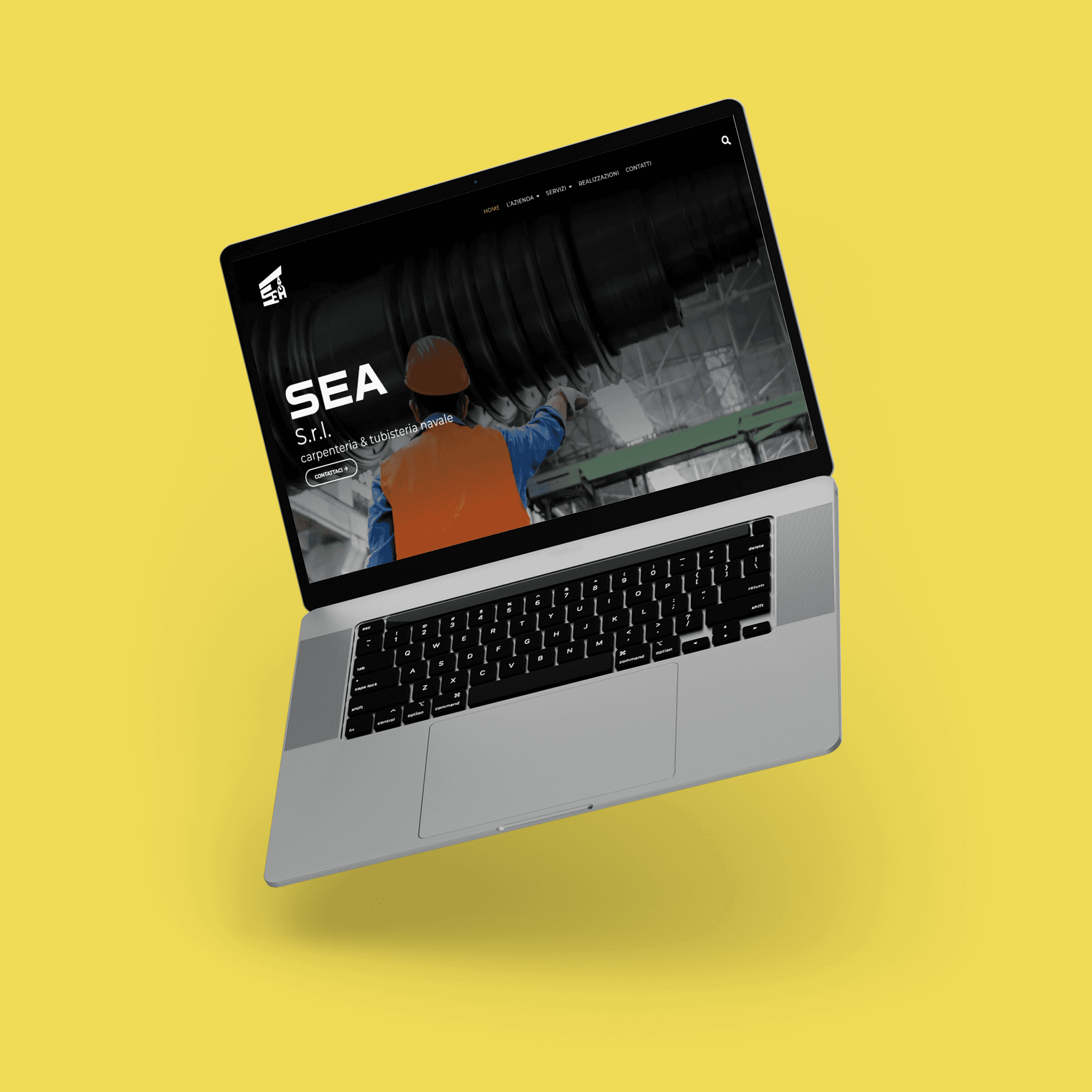
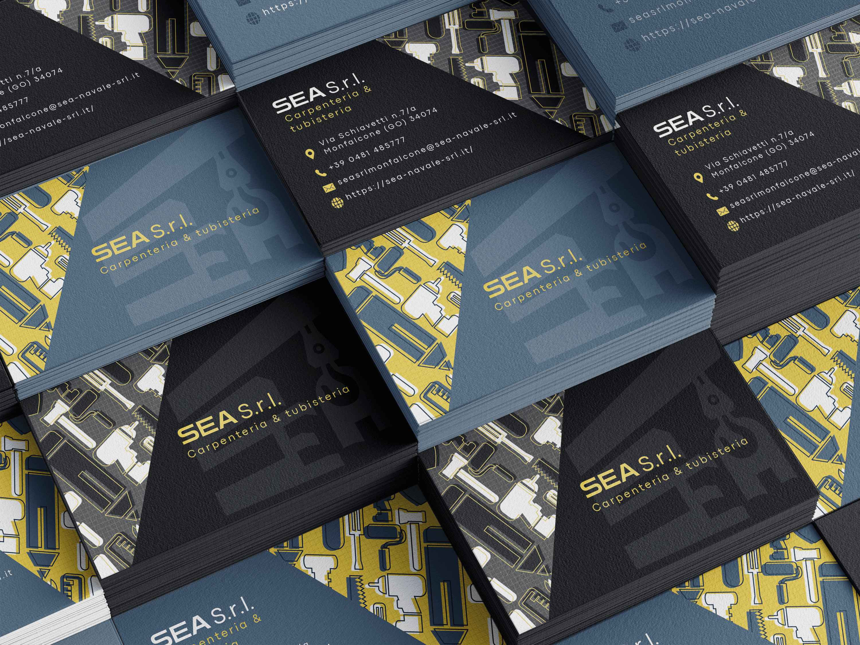
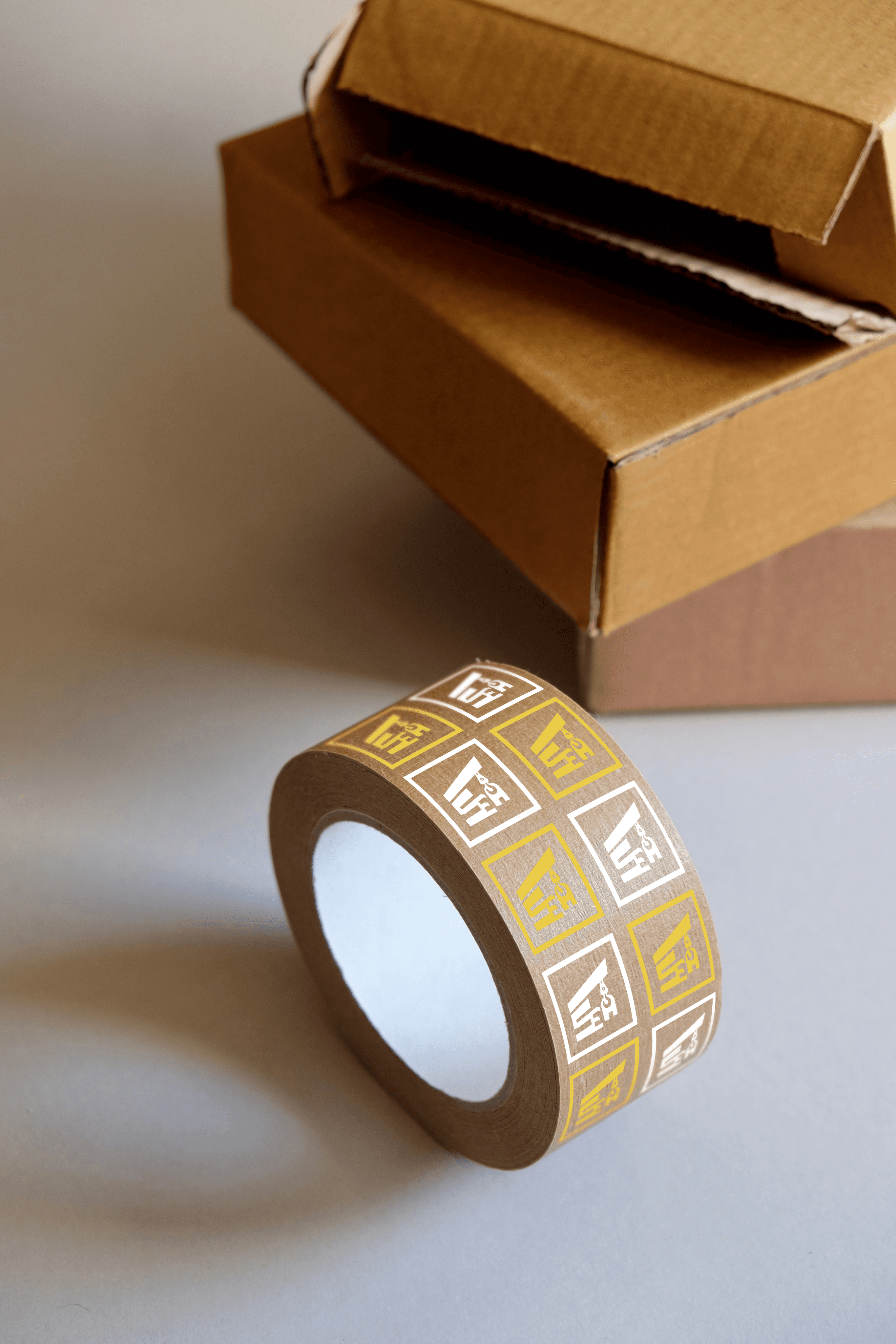
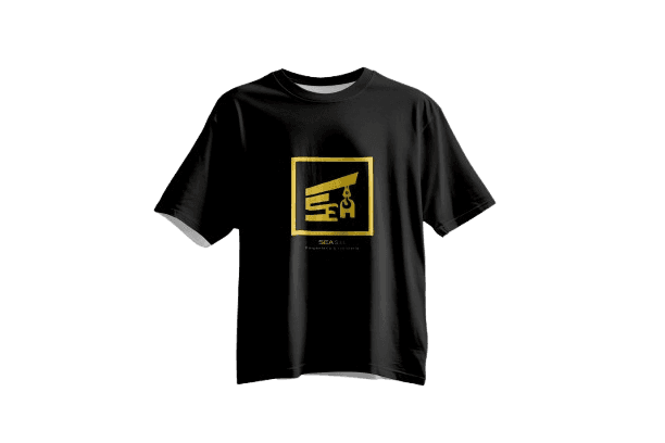
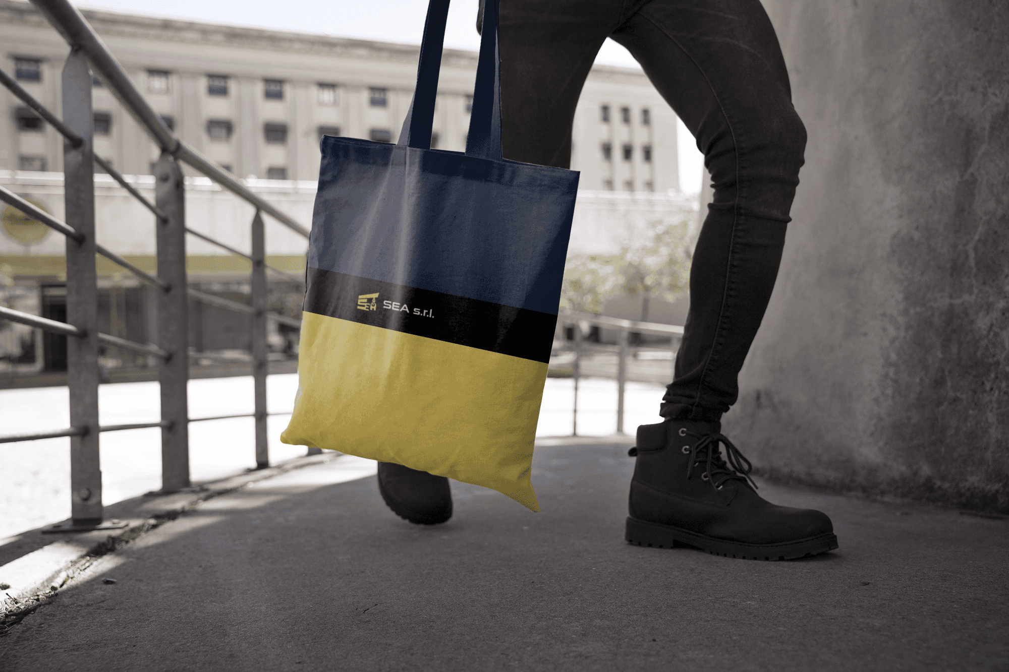
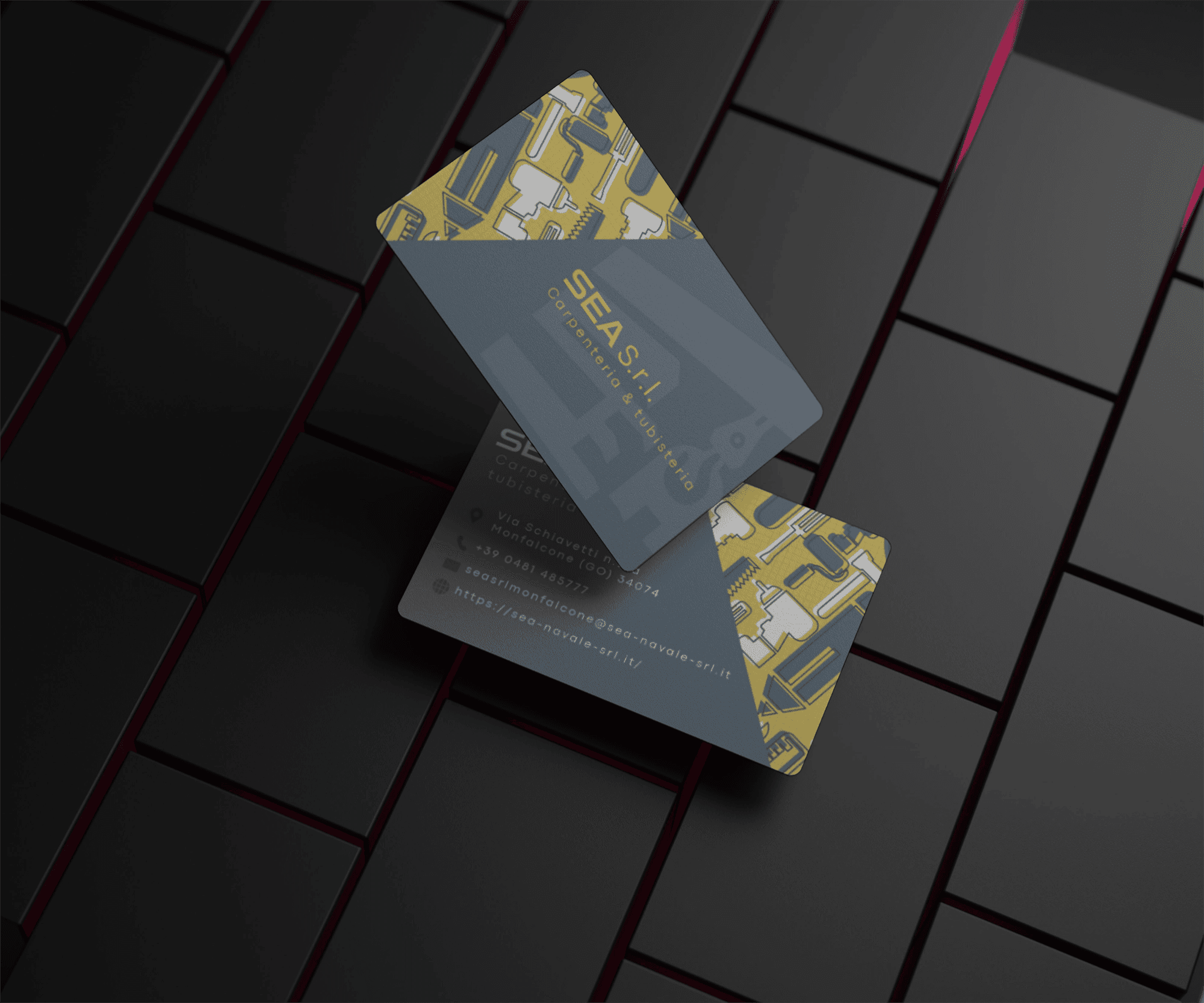
The brand identity project included the design of a logo, website, business cards, and a full range of branded stationery. The creative process began with a direct dialogue with the founders, from which key concepts emerged to define the brand’s essence. Among them, the image of the crane — a symbol of construction and transformation — proved to be particularly meaningful and became the core of the graphic design. The resulting logo integrates this element with a stylized version of the company’s name, designed to convey both structural solidity and a forward-looking spirit, in line with SEA s.r.l.’s operational character and evolving vision.

SEA s.r.l. | Keyword research
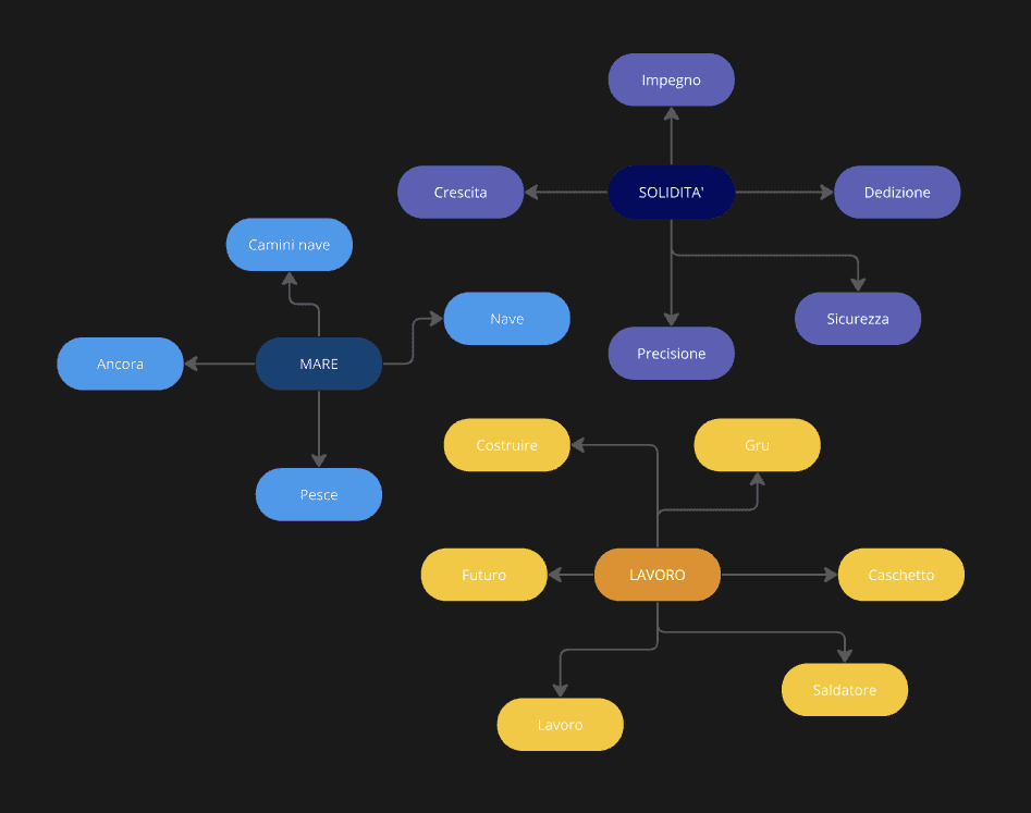
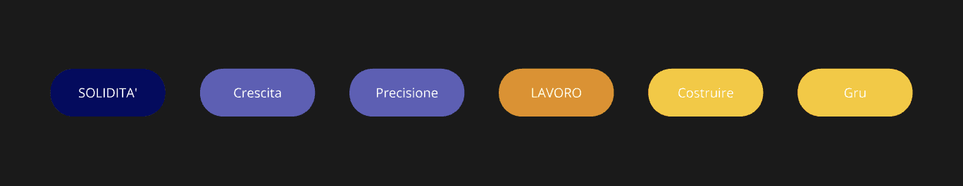
SEA s.r.l. | Keyword research
HEX #4f6174
HEX #4f6174
Blue Bayoux
CMYK 32, 16, 0, 55
RGB rgba(79,97,116,255)
CMYK 32, 16, 0, 55
RGB rgba(79,97,116,255)
Blue Cloud Burst
CMYK 58, 42, 0, 74
RGB rgba(28,39,67,255)
HEX #1c2743
HEX #000000
RGB rgba(0,0,0,255)
BLACK
CMYK 0, 0, 0, 100
CMYK 0, 7, 54, 7
RGB rgba(237,221,110,255)
HEX #eddd6e
Golden Sand
Blue Bayoux
CMYK 32, 16, 0, 55
RGB rgba(79,97,116,255)
HEX #4f6174
Golden Sand
CMYK 0, 7, 54, 7
RGB rgba(237,221,110,255)
HEX #eddd6e
Blue Cloud Burst
CMYK 58, 42, 0, 74
RGB rgba(28,39,67,255)
HEX #1c2743
BLACK
CMYK 0, 0, 0, 100
RGB rgba(0,0,0,255)
HEX #000000
Blue Bayoux
CMYK 32, 16, 0, 55
RGB rgba(79,97,116,255)
HEX #4f6174
Golden Sand
CMYK 0, 7, 54, 7
RGB rgba(237,221,110,255)
HEX #eddd6e
Blue Cloud Burst
CMYK 58, 42, 0, 74
RGB rgba(28,39,67,255)
HEX #1c2743
BLACK
CMYK 0, 0, 0, 100
RGB rgba(0,0,0,255)
HEX #000000
SEA s.r.l.
SEA s.r.l.
SEA s.r.l.
SEA s.r.l.
SEA s.r.l.
ABCDEFGHIJKLMNOPQRSTUVWXYZ
abcdefghijlmnopqrstuvwxyz
0123456789
Sui generis
SEA s.r.l.
AaGg
ABCDEFGHIJKLMNOPQRSTUVWXYZ
abcdefghijlmnopqrstuvwxyz
0123456789
Sui generis
SEA s.r.l.
AaGg
ABCDEFGHIJKLMNOPQRSTUVWXYZ
abcdefghijlmnopqrstuvwxyz
0123456789
Sui generis
SEA s.r.l.
AaGg


About
SEA s.r.l. positions itself as a forward-thinking player in the metalworking industry, combining operational excellence with a newly defined visual identity that reflects its ambition and growth. Rooted in decades of technical know-how, the brand now speaks a visual language that evokes reliability, evolution, and a sense of purpose. The updated identity doesn’t just mark a change in aesthetics — it reflects a strategic shift toward greater visibility, coherence, and alignment with the company’s values. Drawing inspiration from the world of engineering and maritime construction, the identity system is minimal yet impactful, designed to support SEA’s professional image in every context — from digital presence to business communication. With a clean, geometric logo and a cohesive set of brand tools, SEA s.r.l. is now equipped to strengthen its market presence and communicate its identity with clarity, confidence, and intent.
SEA s.r.l. positions itself as a forward-thinking player in the metalworking industry, combining operational excellence with a newly defined visual identity that reflects its ambition and growth. Rooted in decades of technical know-how, the brand now speaks a visual language that evokes reliability, evolution, and a sense of purpose. The updated identity doesn’t just mark a change in aesthetics — it reflects a strategic shift toward greater visibility, coherence, and alignment with the company’s values. Drawing inspiration from the world of engineering and maritime construction, the identity system is minimal yet impactful, designed to support SEA’s professional image in every context — from digital presence to business communication. With a clean, geometric logo and a cohesive set of brand tools, SEA s.r.l. is now equipped to strengthen its market presence and communicate its identity with clarity, confidence, and intent.
SEA s.r.l. positions itself as a forward-thinking player in the metalworking industry, combining operational excellence with a newly defined visual identity that reflects its ambition and growth. Rooted in decades of technical know-how, the brand now speaks a visual language that evokes reliability, evolution, and a sense of purpose. The updated identity doesn’t just mark a change in aesthetics — it reflects a strategic shift toward greater visibility, coherence, and alignment with the company’s values. Drawing inspiration from the world of engineering and maritime construction, the identity system is minimal yet impactful, designed to support SEA’s professional image in every context — from digital presence to business communication. With a clean, geometric logo and a cohesive set of brand tools, SEA s.r.l. is now equipped to strengthen its market presence and communicate its identity with clarity, confidence, and intent.
About

Conclusions
Conclusions
The graphic design project developed for SEA s.r.l. marks a significant step in the company’s journey toward growth and brand consolidation. The entire visual system — from the logo to the website, including branded stationery and communication tools — was designed to reflect the company’s core values: strength, expertise, and a forward-looking vision.
The result is a cohesive and distinctive identity that positions SEA s.r.l. clearly and confidently within the industrial sector, enhancing its communication with clients, partners, and stakeholders.
This branding initiative not only strengthens SEA’s market presence but also reinforces its connection to its own identity, laying a solid foundation for future challenges.
SEA s.r.l. | brand identity
SEA s.r.l. is a company specializing in piping and metal carpentry, primarily serving the naval sector but also operating in other industrial fields. During a period of growth and renewal, the company’s leadership identified the need to establish a strong and recognizable visual identity — one that could represent the business consistently and professionally.
The brand identity project included the design of a logo, website, business cards, and a full range of branded stationery. The creative process began with a direct dialogue with the founders, from which key concepts emerged to define the brand’s essence. Among them, the image of the crane — a symbol of construction and transformation — proved to be particularly meaningful and became the core of the graphic design. The resulting logo integrates this element with a stylized version of the company’s name, designed to convey both structural solidity and a forward-looking spirit, in line with SEA s.r.l.’s operational character and evolving vision.
Client: SEA s.r.l.
Industry: metalworking
Year:2024